Make Your ClientBranch Dashboard Yours: Shortcuts, Numbers and Order
The first screen you see every day should show the things you use. Pin shortcuts to the screens you open most, choose which numbers show, and set the order for the whole account.
Log in to almost any piece of business software and the first screen is the same for everybody. A row of numbers somebody in a product meeting decided were important, a chart you never read, and the thing you came in to do sitting three clicks away behind a menu.
That first screen matters more than it looks. It is the one you see every single time you open the app, so every click it saves you is saved fifty times a week. And every click it costs you is paid fifty times a week too.
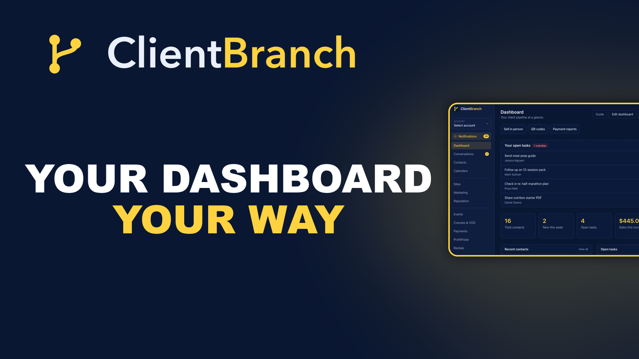
So we made the ClientBranch dashboard yours to arrange. Pin the screens you open most, choose which numbers show, put them in the order that makes sense for how you work, and save it for the whole account. Here is what changed and how to set it up in about two minutes.
The problem with a dashboard that is the same for everyone
Take two ClientBranch customers. One is a hypnotist who sells shirts and show videos at a merch table after every performance. The other is a therapist who runs a calm practice with six clients a day and never sells a physical thing in her life.
The hypnotist opens Sell in person every night. It lives under Payments, so that is a click on Payments and a click on the Sell in person tab, on a phone, with a queue forming. He also checks the QR scan report after every show to see how many people scanned the banner. That is Sites, then QR Codes.
The therapist does not care about either of those. She wants to see who is booked this week and whether anybody has messaged her since last night.
Give them both the same fixed dashboard and it is wrong for both of them. It shows the hypnotist his form count, which he does not use, and it makes the therapist scroll past a stat about published forms to find out that she has three appointments tomorrow.
Shortcuts: one tap to the screens you open most
The biggest win is the simplest. You can now pin shortcuts to the top of your dashboard, and they can point at deeper screens, not just the items already in the sidebar.
That distinction is the whole point. The sidebar already gets you to Payments. What it does not get you to in one tap is Payments, then Sell in person. A pinned shortcut does. The same goes for Payment reports, QR codes, New invoice, New proposal, Appointments, Form submissions, Profit reports, Students, Rental bookings and around thirty other screens.
The hypnotist pins Sell in person, QR codes and Payment reports. Now his dashboard opens with the three buttons he presses every night, in a row, right under the heading. On a phone that is the difference between fumbling through a menu while a customer waits and being at the till before they finish saying they would like a shirt.
The therapist pins Appointments and Conversations, and nothing else. Two buttons, the two things she checks.
Choose which numbers show
Every number on the dashboard is now a widget you can switch off, switch on, or move. The original five are still there: total contacts, new this week, published forms, form submissions and open tasks. We added four more that people kept asking for.
- Appointments, next 7 days. A count of confirmed bookings coming up, linked straight to the appointments list.
- Unread conversations. How many threads are waiting for a reply across email, text, Facebook and Instagram.
- Sales this month. Everything paid since the first of the month, in your currency, linked to the payment reports.
- QR scans, last 7 days. Total scans across all your QR codes, so a banner at a show tells you whether it worked before you have packed it away.
Each number is a link to the screen behind it, so a card is a shortcut too. Tap the sales figure and you are on the reports page.
The hypnotist switches off the two form cards and switches on sales and QR scans. The therapist switches off forms and open tasks and switches on appointments and unread conversations. Same product, two completely different first screens, and both of them right.
Put it in your order
The editor lists your widgets top to bottom, and that is the order they appear on the page. Each one has a pair of arrows. Move sales up above appointments if money is what you look at first. Move your open tasks below the numbers if you would rather see the totals before the to do list.
Numbers group themselves into one row automatically, and the two lists, recent contacts and open tasks, sit side by side, so you never end up with a lonely stat card floating between two panels. When you tick a new number on, it slots in beside the other numbers rather than at the bottom, so there is usually nothing to reorder at all.
How to set it up
You need to be an admin on the account. The layout is shared, so a staff member with limited access sees the dashboard but cannot rearrange it for everybody else.
- Open the Dashboard and click Edit dashboard in the top right.
- On the right, under Shortcuts, click any screen to pin it. Pinned screens jump to a list at the top with arrows to reorder them and a cross to remove them.
- On the left, under Widgets, tick and untick the numbers and lists you want, and use the arrows to set the order.
- Click Save. The dashboard redraws with your layout.
That is it. There is a written guide in the Help Center under Getting started, called Customize your dashboard, and the video below walks through the whole thing on a demo account.
Saved for the account, not the browser
Your layout is stored on the account, not in a cookie on one computer. Set it up on your laptop and it is the same on your phone at the show that night. Add a team member and they see the dashboard you built, so the shortcuts you chose become the way the whole business gets around.
That was a deliberate choice over saving a separate layout for every person. When somebody on your team calls support and says the dashboard looks wrong, we see the same screen they see. And when you show a new hire how things work, you are both looking at the same thing.
You only see what you can use
The picker only offers widgets and shortcuts for modules your plan includes and that are switched on for your account. If you are on Core, you will not see a shortcut to the website builder, because you do not have one. If you later switch a module off, its widgets simply stop showing. Nothing breaks and nothing needs tidying up.
And if you ever want the original layout back, Reset to default is at the bottom of the editor. One click and the stock dashboard returns.
Why this is worth two minutes
Nobody buys software for its dashboard. But everybody uses the dashboard, every day, more than any other screen. Two minutes of arranging it around the three things you do most pays for itself by the end of the week, and then keeps paying.
If you have not touched yours yet, open ClientBranch, click Edit dashboard, and pin the one screen you are tired of digging for. Start there. You can always come back for the rest.
Try ClientBranch free for 15 days
Get booked, get paid, and keep clients coming back, all from one place. No card required, cancel anytime.
Start my 15-day free trial